

It is now essential to have an online presence for your Kindergarten that provides a quick and easy way for your audience to find you and access information and resources.
You could create a website with a third party host like Wix, Weebly or Squarespace or use Social Media pages such as Facebook. Many volunteers and staff enjoy the ease and convenience of these options. However, those are proprietary platforms that don’t allow you to migrate your site, so you might be locked in.
WordPress CMS
This guide assumes you are developing a WordPress website for your kindergarten. WordPress is the CMS (content management system) we usually install for kindergartens. A CMS simply means a computer application that allows you to create and edit the content and publish it online. In the past these tools were often installed on your station, but modern CMS like WordPress are installed and run from your website.
WordPress is widely supported, updated and modular. If you needed to change web providers, you can even download your WordPress site and take it to another provider.
Inspiration
Look at a range of sites that perform a similar role. What doesn’t work, is distracting or is frustrating? What content do you see first? How are menus and pages organised? What actions are easy to take? How many clicks to find things? How far did you need to scroll? How much text? How many images? What is the site prioritising?
Planning your online presence
Lists and brief notes
In planning how you will create an online presence, firstly identify your audiences, what it is they want and order these things in priority.
Your visitor’s experience depends on your site’s design anticipating their needs and then providing solutions as quickly as possible. Key visitors to a kindergarten’s website are of course prospective families. Other groups are committee members, contractors, enrolled families, staff etc. All have different needs.
Also think about how you want the website to represent the service or how to put the site to use, perhaps to grow a mailing list, make announcements, conduct a survey etc.
Usability
Spend some time to define some of your visitors, their needs or goals, how your content can help and where they can find it.
Your visitors: Who are the site’s users? Try to identify a few specific groups.
Their goals: What are each group of users looking for? Define their primary goal or tasks.
Your content: Identify the most immediate, crucial information each group need for their goal. What terms can you expect them to recognise, how should you signpost things. Define the primary and secondary content.
Example user ‘Contactor’: Wants to contact the service. Looking for referral in a hurry, hasn’t decided how they will make contact yet.
Primary goal: Contact the service
Primary content: Service address, phone, email
Secondary content: Open hours, social mediaExample user ‘Prospective family’: Wants to know service location and what makes the service special or different. How to register or contact.
Primary goal: To be impressed by the service and to register interest in enrolment
Primary content: Service address, service offerings & values, contact form or enrolment link
Secondary content: Phone, email
Design
Site map (flowchart)
When walking people will find the most efficient path to travel. It should be the same for visitors browsing needed information on your site. Keep the goals of your example users in mind as you focus on information and structure so you can create a logical skeleton for the site.
Organise your primary and secondary content into groups and hierarchies that serve the various example user’s needs. This is called Informational organisation or information architecture. This hierarchy can be sketched out in a flowchart and can define not only the order of content on a page but also the order and titles of pages across the site’s menu.
A traditional brochureware site:
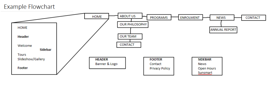
You can sketch out on scrap paper or use a diagramming app. The example above was made in Microsoft OneNote but you could also use any number of free online flowchart apps.
Common example sections or pages:
Home | Policy |News | Media | About | Staff | Contact | Gallery
Other examples from early childhood services might include:
Philosophy | Programs | 3 Year Old | 4 Year Old | Enrol | Committee
It can be helpful to organise some things into the familiar shorthand of static pages of a traditional brochureware site but try to prioritise what you learned from mapping out the example user’s goals. What do they really need to see? What can be folded into another section? What should your front page prioritise?
Some browser-based flowchart apps:
Menu design
At this point don’t worry about the look of the menu nor even where it will be located on the site. Think about the number of entries, their labels and their order. Your site’s main menu will have at least a top row of entries and likely some nested sub entries. Consider how you will group the sub entries. Look out for ambiguous labels and avoid confusing duplication among sub entries.
Many WordPress set-ups also allow you to add secondary menus of social media links. They might simply appear as a row of icons but are treated as a menu by WordPress.
Understanding how the web is built:
https://www.youtube.com/playlist?list=PLo3w8EB99pqLEopnunz-dOOBJ8t-Wgt2g
This guide continues with Tip – Website content creation and gathering